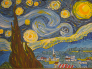
For my birthday, I received a paint-by-numbers kit for the painting 'A Starry Night' by Vincent Van Gogh. Because I assume that the museum housing the original owns the rights to the use of its image, the painting I did is the popularized version of the painting. It was done in acrylics, rather than oil. I've included the metamorphosis of this painting because it made me think of my weight loss.
When someone else is losing weight, it seems to be in leaps and bounds--going so fast. First they're a little smaller, then more, and then suddenly they're skinnier than they've ever been!!
When you're the one losing weight, you really learn how small the incremental changes are. I don't notice it myself most of the time--every once in a while, I see myself in the mirror or in a picture, and I think, "this is really making a difference!"
But I'm impatient. I spent all yesterday on this painting because I wanted it done as soon as possible--not because I wasn't enjoying it, but because I wanted to see the final product. I also get impatient on my weight loss. So much work over the course of so many days. And really, it's a lifelong process. I get cranky waiting a month for my grades to come out--it's be three months since I started on Weight Watchers, and there's a part of me that thinks, why can't I just be done now!??!
At points, I felt the same way about the painting. But the leaps and bounds only come at the expense of lots and lots of detailed work: in painting, that's outlining and waiting for colors to dry, and repainting the same areas until they're just right. In weight loss, that's measuring out food every day. That's keeping track of everything you eat. That's dragging yourself back onto the exercise equipment when all you really want is a nap. My transformation may come more slowly, but for now, enjoy the leaps and bounds of Anne's "A Starry Night."
 the canvas was not actually numbered--the main features of the painting were sketched out, and a detailed instruction book told me how to fill them in.
 these captions all sound really insecure, but I had a really good time painting this. This part was fun because I had to stylize each star differently--different color patterns, different concentrations. When you look at the real painting, the circle stars are barely visible as regular circles--they're very, very diffuse. (also, a lot of blank canvas shows through the paint on the real painting).
painting the village was very different from painting the sky. The village was still impressionistic but is in sharper focus. It took a long time to get all the lines right and to add texture to the trees (admittedly very simple texture).
 adding texture to the tree was also fun The best thing about the tree is how it seems like a flame shooting up into the sky. You see that more when the yellow is added at the end (*retroactive spoiler alert*)
 I also I loved adding the red. This is one feature very unlike the original painting--which is really done in all shades of blue. When you look at the original, it's a little bit of a bummer because it is so different from the image you have in your mind.
 The painting is almost finished here. Note that the promised yellow has been added, the foreground bushes are swirly, and the houses in the village have been tinted a light blue--as if in twilight.
In this last picture, I fixed a few things. The moon had been slightly obscured by some white paint. I went over it again in the original deep yellow. I also changed the shape of the galaxy swirl on the lower right hand--trying to make it look more like it's supposed to!
Now it's finished. But is it ever REALLY finished?


No comments:
Post a Comment